Become a Member
 login
login

10 Easy and Cost-effective Ways to be More Accessible
Here are some simple and easy ways to improve your accessibility right now, for little to no cost:
- Paint (or tape): Paint any cracks, curbs, obstacles, stair nosings (alternatively you can tape it with a high visibility tape. Paint any doorways and walls to ensure that they are in contrast with each other (to make the doorways easier to see and find, this applies to anything that might need to be seen and found). Paint directional arrows or lines along the wall to direct people, or tape along paths of travel to create false aisles or halls that indicate where people should be walking/rolling. Paint parking lots to have the proper sized parking stalls and access aisles.
Tape and paint can go a long way in making things more accessible if done right.
- Hardware: As with the door frames, you might want to check and make sure handles are in contrast with door colours. You also want to have door knobs, faucets, dispensers, light switches (anything operable) can be done with one hand and a closed fist- switch your knobs out for levers, switch out dispensers for automatic if possible etc.
- Signs: Typically, signage can be increased and improved. Find signs that have braille for your washrooms, to identify what room you’re going into, what floor you are on (many of these are available at your local hardware store). It is important these are placed consistently and at the right heights (1.2 meters to the centreline). Make sure they are put somewhere that makes sense for someone to feel for. For less common signs, make sure they are high contrast, the font is large and if possible tactile. For specifics, look no further than CNIB’s Clearing our Path. Use symbols when it’s appropriate, use signs to identify and direct, and inform.
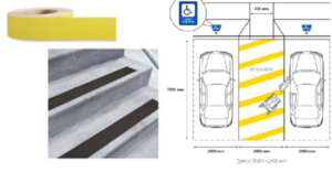
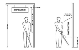
- Tidy: Keep paths, accessible stalls and change rooms, and waiting areas clear. It is very often that areas designed for people using wheelchairs become storage, and then when someone comes in needing to use it it is a mad dash to clear it, or worse, they are told it’s out of order. Prioritize keeping the most needed areas clear like the check out area, waiting area, the path to the washroom and the path in and out of the building. 1.5 meters is suggested as the width of a path of travel, with 920 mm being the smallest. If you are a store with many aisles and not a lot of space, make a thoroughfare that is wider and stock the most popular items in that area. Keep in mind protrusions from the walls as well! People who are blind or low vision use walls as guiding tools and you don’t want to hurt them. Check the cane detectability guide below.
Dimensional criteria for ensuring that protruding objects and other obstacles are cane detectable
- Atmosphere: Keep background noise to a minimum and turn music down if asked or you notice someone struggling to hear you or others. Dimmable lights are preferred as some people need high levels of light (like people with low vision) and others might want a softer light (like people with sensory disorders). Prioritize keeping it bright, but in spaces where people are there longer (offices for example) have lamps available in case a worker or client wants to move to a low light (think of if you’ve ever had a headache and have turned off the fluorescents) . Other things to consider: becoming a scent free place, using low VOC chemicals, adding plants, and/or offering sensory times.
- Adjust: Many doors are equipped with door closers that might need to be checked to make sure they aren’t closing too fast. Elevator timings are another thing to check (ask your elevator inspector next time they are in). Weather mats should be bevelled and non-slip. Door thresholds and smaller lips or curbs* (under 2 inches) can be adjusted for with rubber mats or metal plates to make them more traversable. *A curb cut or properly built ramp should be the long term goal and these used only as a low cost interim alternative.
- Assess: There are many self-assessments tools available. One I recommend is the Checklist for Accessibility and Universal Design by the City of Edmonton. It is imperative to be honest with yourself going through this checklist, correct information is the best for people to make informed decisions when coming to your establishment. *As you are going through this list, write down actual measurements, even if they aren’t a pass by this checklist standards, different people have different needs and it’ll come in when you are making your Accessibility Statement
- Statement: Make an accessibility statement to have available. Different things will want to be included depending on the nature of your building and what you do, but the primary goal is to deliver any relevant accessibility information to potential visitors (like how wide the door is) and to let them know your commitment to accessibility. If it’s within your means, create an accessibility page on your website to have this information, or include it with your address. We suggest starting with a commitment to improving accessibility for people with disabilities, listing things that might pose barriers, and finally offering a way for people to provide feedback. Posting this on your website is good, but you want to make sure staff, volunteers, etc are aware of it or know who is responsible for answering accessibility questions.
- Train: You want your staff/volunteers to feel confident in helping your disabled patrons access your goods or services. As mentioned in the above point, you will either want to train the whole team, or ensure you have someone who is your accessibility connoisseur, depending on the size and nature of your business. You will want to make sure people are aware of and familiar with the results of your self-assessment and where to find the accessibility statement. You might also want to train in general on etiquette and tips for serving people with disabilities, and for that may we direct you to our Disability Awareness Presentations.
- Ask: There are lots of things to ask. If you are able to connect with someone before they come to your space and they disclose that they have accommodation needs, ask what you can do to make it easier (again having the knowledge of the barriers that exist will really help with this). While they are there ask if you can help them (they might not need it) and how you can help them (do not assume you know). And most importantly, ask for feedback specifically about accessibility. If you are a business that already runs a survey (retail and restaurants often do this) add a question about accessibility. If you don’t already have a mechanism for asking, the accessibility page mentioned above or a listed contact for accessibility concerns can be very impactful.
If you have questions or want advice on any of these tips please contact us